I told you a bit about my design and rebranding process for my website. I did not, however, tell you how I came up with my new logo.
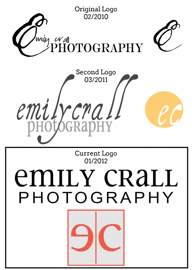
My logo used to be an “ec” inside a circle. I really liked that, but, as I mentioned with my website, I discovered my adoration for lines and knew that, in order to keep everything mutual, I needed to get rid of the circle. I wasn’t intentionally going for a box as a replacement, but it just kind of happened; I don’t honestly remember exactly how.
I played around for a while with my initials and couldn’t find anything that I liked. Then I tried flipping the “e” horizontally and, bam, with the right font, it was a near reflection of the “c”. It felt nicely balanced. To help with the “reflection” aspect of it, I added a narrow line up the middle, not quite connecting to the top and the bottom of the box. It acts as a mirror, but also, coincidently, looks like my middle initial “l” for “Lorae”.

For the main logo, which is full business name, I wanted something simple and clean and easy to read. (Side note: I used to work at a dermatology office and the logo was mostly the name with “dermatology” written so small underneath that it was hard to read. I always commented that people should be able to look at the name and KNOW that it’s a dermatology clinic without having a magnifying glass.) So I wanted “photography” to be present, while also having my name be slightly larger since I am, after all, the face, the photographer, the designer, the marketing director, the editor, the everything behind the company. I build my business on relationships so I do want people to recognize my business because of my name, but I want those who don’t have a relationship with me yet to know what exactly “Emily Crall” does: photography.
As I did before with the square logo, I wanted a sense of symmetry which led to a very clean, full logo:

Take a look at how my logo has changed over the years! And no, I will not–hopefully–be changing this every year. Starting a business and firming down who you are as a photographer, designer, business owner, etc. has taken a while. I feel like I’m finally arriving.

add a comment
+ COMMENTS