My Design Process of Creating a Website (Visit me now at www.emilycrall.com!)
If I were to do it again, I’d hire it out. Designing and branding it hard work, especially when you are trying to brand yourself. But Promise Tangeman’s wait list is long. So I tackled it alone.
At the beginning, I jotted down some notes and pulled some images, designs, and color palettes that I liked.

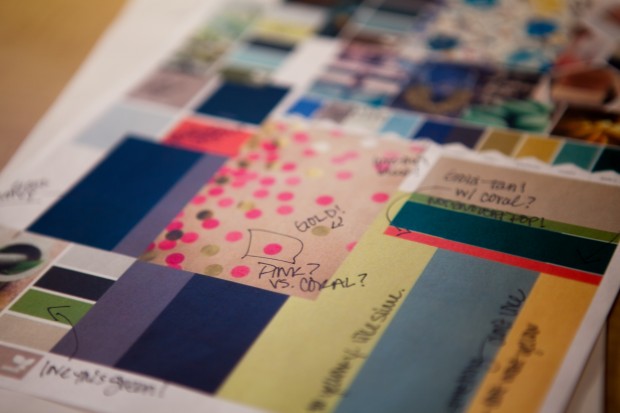
Choosing a color board:
I loved blues and golds, but couldn’t figure out how to work them in. They looked too sailor-ish and, though I love that look, I don’t define “sailor”. Also, I wanted to keep a simple palette and have just one pop of color. Since I generally love color, it was hard to keep things semi-monochromatic and choose just one color pop. Since I tend to like more rich blues, like navy, I knew that I couldn’t use that as my pop of color. (Special insight: though I love blue in general, I actually wanted to incorporate it mostly because it was my grandma’s favorite color.)
In my color search, I came across a beautiful coral color that I loved! It didn’t fit my normal since I don’t have a lot of coral in our home (I have one coral shirt and one coral necklace. There are no coral accent pieces in our home.), but the more I tried to use blue or green, the more drawn I was to the coral. There was something both warm and welcome about it. It said something without actually speaking.
So my “final” colors were black, dark grey, light grey, and coral. That was one week before my website went live.
With my website already designed and nearly ready to go, I realized that I didn’t use either colors that I actually wanted when I started: blue and gold! I found a beautiful golden tan color and decided to keep the grays and blacks, but also incorporate the gold into the scheme.
In two days time, I did a complete re-haul and ended up with: gold, coral, gray, and black. It was only after I was completely done did I realize that I now have something in common with Burberry.

Defining my style:
I originally started with a light grey chevron background that I created. No, wait, I originally-originally wanted a wooden background with lots of green and white. (Can you see how indecisive I was?!) So I started designing a website with a dark wooden background and eclectic white frames around the photos on the website. After spending days and hours on that, I realized that it wasn’t ME. I loved it…but I loved it for someone else. It wasn’t my style.
That’s when I decided that, above all, in this process I need to be true to myself, not who I wish to be.
So I completely deleted it. I mean, delete, done-zo, gone. And I started over.
I had been eyeing Promise Tangeman’s StyleGroups for ShowIt for a while and so I went through a very thoughtful process of figuring out which ones I liked best and WHY I liked them. In that process, I realized that I’m a clean-lines kind of person. I like structure and I like things to be clean and easy-to-navigate. I don’t like going to websites where there’s no clear place to start. They look cool, but they end up frustrating me. If I can’t figure it out with one-click, I’ll most likely leave the website.
I quickly narrowed my choices down to 3 and then got my husband’s opinion. And just like when you flip a coin, as soon as I asked for his opinion, I knew which one I hoped he would choose.
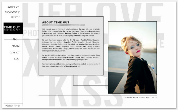
So, like that, I made my decision. This is what the Time Out StyleGroup originally looked like.

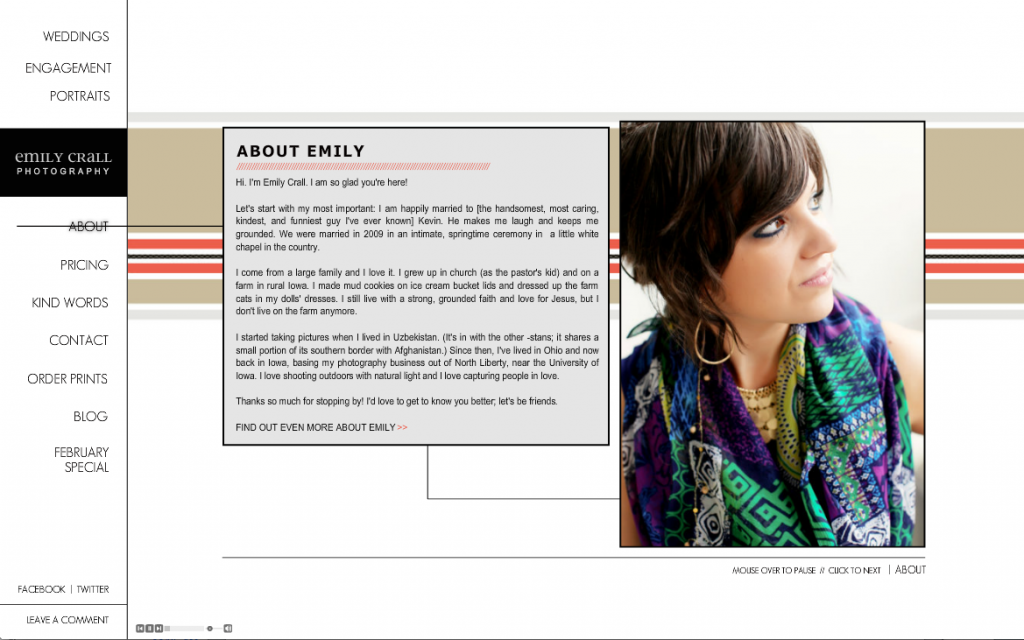
After reworking it, it looks like this:


Designing the background:
I loved the background that came with the StyleGroup, but I, again, wanted to make this website mine. I knew I needed to change it, but didn’t know what to change it to. Since I currently love chevron, I designed a gray chevron background with one line of coral. That was it. I thought I was done.
I liked it. It looked great. But then I looked at it from an outsider perspective and realized that it was a little cold. It didn’t look as welcoming and warm as I wanted it to. This was also the time I realized I wanted to add that warm gold back into my color palette. It didn’t work to add gold into the gray/coral chevron so I knew I needed something else.
And then I had an epiphany: I wanted clean lines…lines. I love lines. My whole website is based on lines. My album designs are based on lines. I love lines. So why was I trying to zig-zag it up with chevron when, at the heart of it, lines are my thing?
After I came to terms with that, the rest was easy. I had my color palette: gray, black, gold, white, and coral. Since I wanted a lot of warmth, I used more gold than any other color in the background (aside from white) and then added two tiny pops of coral lines. The rest was filler of gray and black.

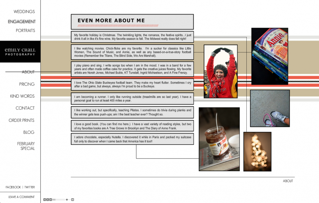
I love how it turned out! I love how the colors are somewhat muted, which lends to the photos showcasing themselves easily. I love the clean lines. I love the page changes and the uncluttered look. I love how there’s a clear direction of where to go next and how you’re never more than one visible click away from home. (Nothing is worse than getting lost in a website!!!)
As for the blue? No worries, I used blue in my updated photos. I have a lot of blue in my wardrobe and, at the last second, I put together an outfit using a simple blue dress that I have and gold accents. It turned out to be the perfect choice.

Addendum: Many thanks to the team at ShowIt for answering all of my questions along the way, to Sitehouse (and Promise Tangeman) for the initial design, and to the Showiteers online group for being an awesome sounding board and providing honest feedback along the way. So proud to be a part of you guys!
add a comment
+ COMMENTS