A lot of my wedding couples want to use a photo (or two) for their save the date cards. Typically, the actual invitation is more formal, but the save the date is a really fun way to put your best face forward (pun fully intended). I’m going to break down my tips into two categories: one for photographers and one for the couple.
First off, photographers…
PHOTOGRAPHERS
1) Shoot off-centered. For photographers, this is known as the rule of thirds. By placing the couple to the right or left of the frame, you are giving room for text on the other side. By all means, don’t shoot all of the photos this way, but I know from working with many designers how happy they are to have room to place a text overlay. (This works especially great for horizontal save the dates.)
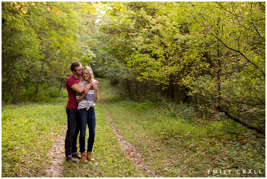
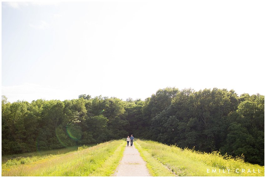
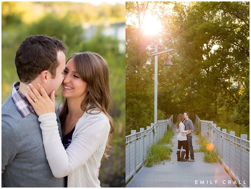
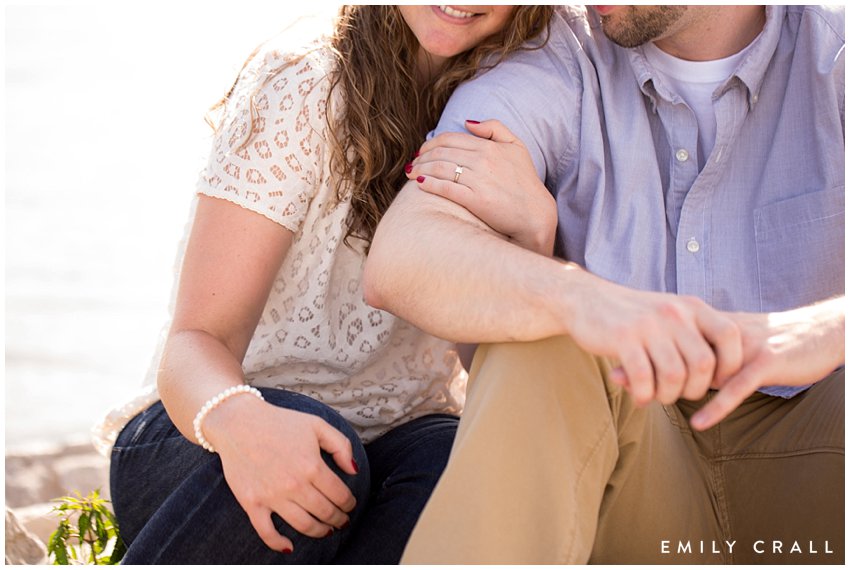
4) Sometimes the photo the couple ends up picking is not one that you’d initially think would easily fits into a design space. Don’t worry. There are so many beautiful templates available that nearly any photo can work depending on the design. If the couple is working with a design company, the professionals can advise them on what looks best or make a photo work into the space. By giving a variety to choose from though, you’ve covered all the bases and that means they can easily pick a photo that means the most to them based on their interaction, body language, smiles, etc. And that’s really the most important thing.
COUPLES
1) If you know in advance that you’ll be using a photo for your invitation or save the date, try to coordinate your clothing choices with your wedding. Your entire paper suite will be based on the colors and/or theme you have chosen for your wedding so the photo (and you guys in said photo) should also coordinate with that. This couple was having a Gatsby-themed wedding so they incorporated that style directly into their engagement session. And their final save the date looked awesome because of it. (If you’re looking for some cool save-the-date styles, check out Paperless Post!)
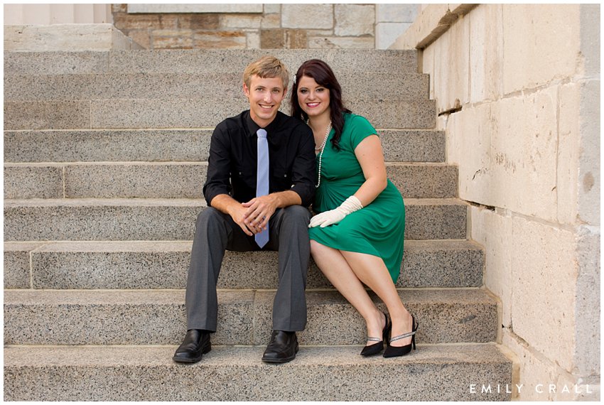
2) Regarding tip 1, know that if all else fails, you can use a black & white image. Black and white images look especially great with gold foil lettering or if you want to make a pop with the text.
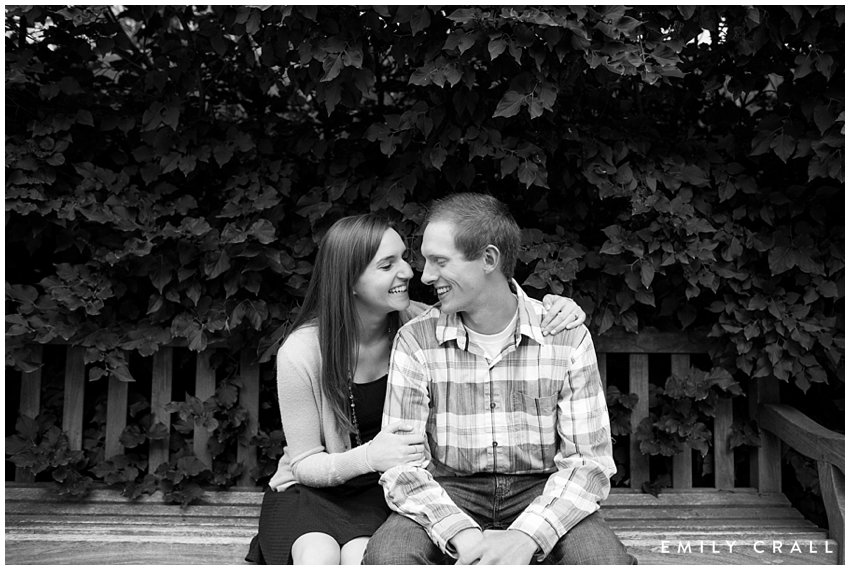
3) Go into your engagement shoot with an open mind. It’s difficult as an artist to have a couple say, “we’ve already picked out our save the date so can you take a photo that fits into this template?” While it’s doable, the Murphy’s law chances are really high that you’ll end up loving a different photo even better and then you’ll be in a pickle. Choose the one that fit your pre-determined template or choose the one that you absolutely adore? I’d definitely rather pick one that showcases love the best and then pick the design around that.
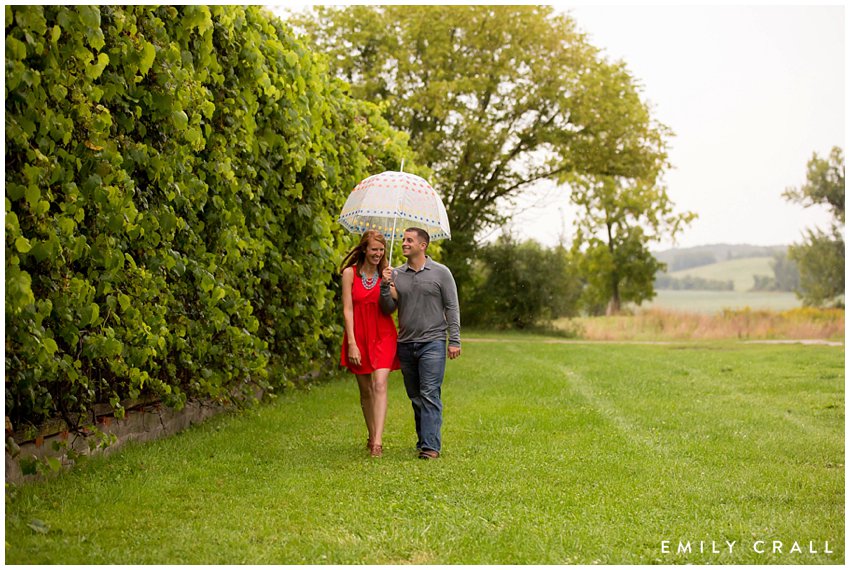
4) Make sure that you’re on the same page as your photographer. I always tell my couples that I want to capture their true selves. If they are a silly couple who always laughs, they’re probably not going to love photos of them being really serious. Why? Because that’s not how they see themselves in their daily lives. Your photos (both engagement and wedding!) should reflect who you are as individuals and a couple.
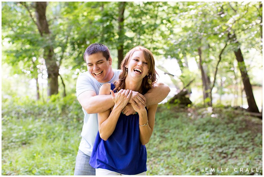
5) Relax. Your engagement shoot is about so much more than getting an image for a card. Your engagement session is a time to practice with your photographer and to breathe in the excitement of your wedding day coming up. By the time you’re done with your engagement session, you’ll be pros and that will leave you so much more comfortable for wedding day photos. Think of the engagement session as a trial run. You can’t mess up.
add a comment
+ COMMENTS